
The Surprising Link Between GDP & Lifespan
In today’s world, the economy of different countries can vary greatly. Looking at what services are available to people who live in wealthy countries, and what services are available to people who do not, I began to wonder if the economy has any impact on life expectancy. The question that I seek to answer now is: does a nation’s economy affect how long its people live? To explore this question more in depth, I conducted a data analysis comparing the GDP and life expectancy of six countries. By looking at the relationship between GDP and lifespan, I hope to understand whether a better economy might increase the life expectancy in developing countries.
Background Information and Data Sources
Gross Domestic Product (GDP) is the total monetary value of all goods and services produced within a country over a specific period, usually over one annually. When divided by population (GDP per capita), it provides the average economic status of people in the country. Life expectancy, however, measures the average number of years a person is expected to live based on current mortality rates.
For this analysis, I used publicly available datasets from six countries. The countries are China, Zimbabwe, United States, Chile, Germany, and Mexico. I used the data from 2000-2015. The data analysis program I used to sort, compare, and display the data was Python.
Visualization Analysis
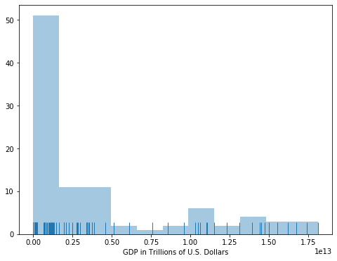
The visualizations created from the dataset, which include scatter plots, line and bar graphs, and violin graphs, show an interesting relationship between a country’s GDP and the lifespan of its residents. Exploring data through plots can sometimes be much more effective. The first exploratory plot I generated was the US GDP. The distribution of `GDP` in the data is very right skewed where most of the values are on the left-hand side. This type of distribution could be described as a power law distribution, which is a common enough distribution that it has its own name.
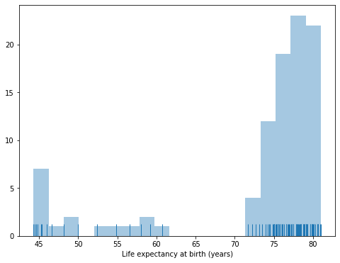
Next the distribution of `LEABY` (Life Expectancy at Birth Years) was examined. The distribution of `LEABY` in the data is very left skewed where most of the values are on the right-hand side. This is almost the opposite of what was observed in the `GDP` column. A further look might also identify different modes or smaller groupings of distributions within the range.
Next I broke down the data by `Country` and the average values for `LEEABY` and `GDP` are created, bar plots showing the mean values for each variable are created below.
The first plot is Life Expectancy and all of the countries except for Zimbabwe have values in the mid-to-high 70s. This probably explains the skew in the distribution from before!

For the average `GDP` by `Country` it seems that the US has a much higher value compared to the rest of the countries. In this bar plot, Zimbabwe is not even visible where Chile is just barely seen. In comparison the USA has a huge GDP compared to the rest. China, Germany and Mexico seem to be relatively close in figures.

Another way to compare data is to visualize the distributions of each and to look for patterns in the shapes.
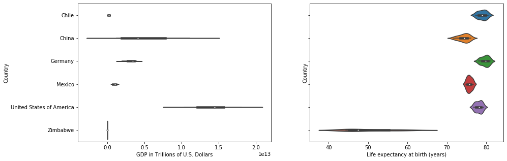
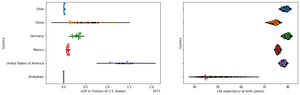
The violin plot is a popular choice because it can show the shape of the distribution compared to the box plot. Below, country is on the x-axis and the distribution of numeric columns : `GDP` and `LEABY` are on the y axis.
In the `GDP` plot on the left, China and the US have a relatively wide range, where Zimbabwe, Chile, and Mexico have shorter ranges.
In the `LEABY` plot, many of the countries have shorter ranges except for Zimbabwe which has a range spanning from the high 30s to the high 60s.
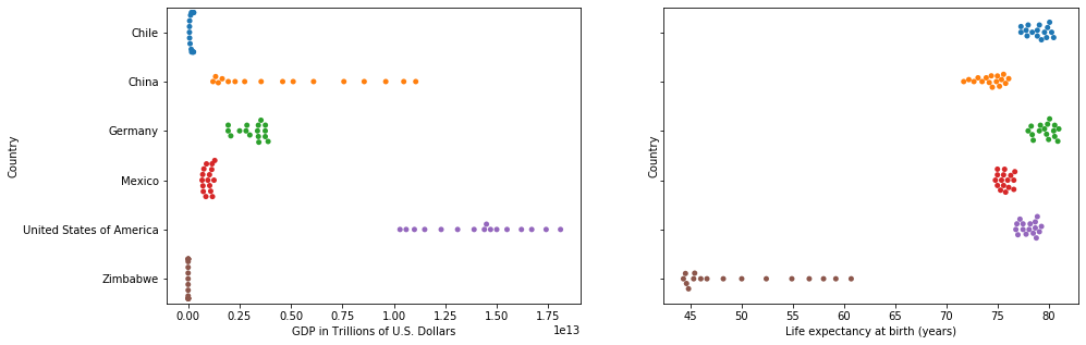
Another newer method for showing distributions is the swarm plot, and they can be used to complement the box and violin plots. First the stand alone swarm plot is shown and then overlayed on top of a violin plot. Swarm plots are useful because they show dot density around the values as well as distribution through area/shape.
In the case of of the `GDP` plot on the left, Chile and Zimbabwe have a vertical line of dots that illustrate the number of data points that fall around their values. This detail would have been lost in the box plot, unless the reader is very adept at data visualizations.
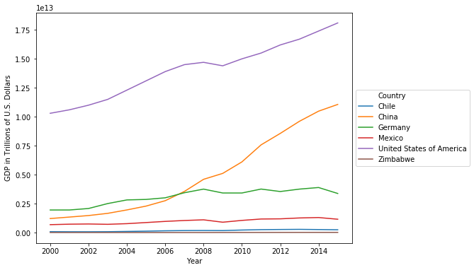
Next the data will explore `GDP` and `LEABY` over the years through line charts. Below the countries are separated by colors and one can see that the US and China have seen substantial gains between 2000-2015. China went from less than a quarter trillion dollars to one trillion dollars in the time span. The rest of the countries did not see increases in this magnitude.
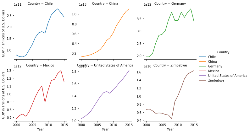
Another aspect that was looked more into depth was the faceted line charts by Country. In the individual plots, each country has their own y axis, which makes it easier to compare the shape of their `GDP` over the years without the same scale. This method makes it easier to see that all of the countries have seen increases. In the chart above, the other country's GDP growth looked modest compared to China and the US, but all of the countries did experience growth from the year 2000.
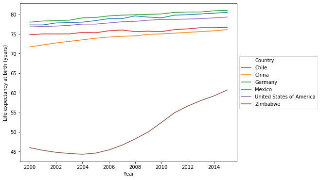
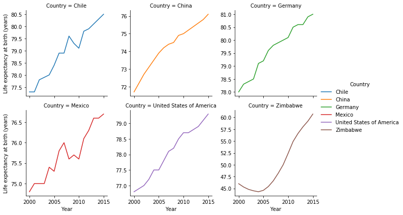
The chart below shows now looks at life expectancy over the years. The chart shows that every country has been increasing their life expectancy, but Zimbabwe has seen the greatest increase after a bit of a dip around 2004.
Much like the break down of GDP by country before, the plot below breaks out life expectancy by country. It is apparent that Chile, and Mexico seemed to have dips in their life expectancy around the same time which could be looked into further. This type of plotting proves useful since much of these nuances were lost when the y axis was shared among the countries. Also the seemingly linear changes were in reality was not as smooth for some of the countries.
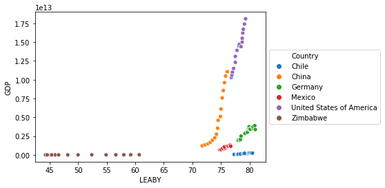
The next two charts will explore the relationship between `GDP` and `LEABY`. In the chart below, it looks like the previous charts where GDP for Zimbabwe is staying flat, while their life expectancy is going up. For the other countries they seem to exhibit a rise in life expectancy as GDP goes up. The US and China seem to have very similar slopes in their relationship between GDP and life expectancy.
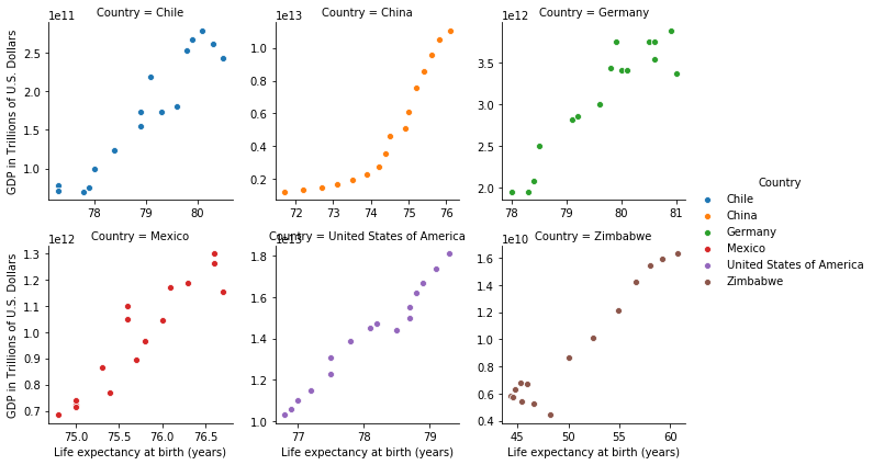
Like the previous plots, countries are broken out into each scatter plot by facets. Looking at the individual countries, most countries like the US, Mexico and Zimbabwe have linear relationships between GDP and life expectancy. China on the other hand has a slightly exponential curve, and Chile's looks a bit logarithmic. In general though one can see an increase in GDP and life expectancy, exhibiting a positive correlation.
Conclusion and Limitations
This project was able to make quite a few data visualizations with the data even though there were only 96 rows and 4 columns.
The project was also able to answer some of the questions posed in the beginning:
- Has life expectancy increased over time in the six nations?
- Yes with Zimbabwe having the greatest increase.
- Has GDP increased over time in the six nations?
- GDP has also increased for all countries in our list, especially for China.
- Is there a correlation between GDP and life expectancy of a country?
- Yes there is a positive correlation between GDP and life expectancy for countries in our list.
- What is the average life expectancy in these nations?
- Average life expectancy was between mid to high 70s for the countries except for Zimbabwe which was 50.
- What is the distribution of that life expectancy?
- the life expectancy had a left skew, or most of the observations were on the right side.
Further research could explore additional variables, such as healthcare spending, education levels, or inequality indices, to gain a more comprehensive understanding of what truly drives longevity. Investigating changes over time could also reveal how improvements in GDP impact life expectancy in the long term.